Friday, September 12, 2008

3rd Assignment [Poster] - Finalization

Here is my final work:


POSTER TITLE: SAVE THE TREES

A POSTER THAT I MADE HAS JUST A SIMPLE GRAPHIC PRESENTATION.
THE POSTER SHOWS A SHINY AND REFLECTIVE SPHERE, WITH A TREE AND
TWO HUMANS INSIDE THE SPHERE. AT THE TOP OF THE SPHERE, I PUT
'SAVE THE TREES' QUOTE WHILE AT THE BOTTOM OF THE SPHERE IS
'BEFORE IT'S TOO LATE'. THE SPHERE CAN BE REPRESENTED AS AN EARTH. TWO HUMANS INSIDE THE SPHERE ARE ACTUALLY LOOKING TOWARDS THE TREE. IT JUST LIKE THEY WANT TO FOCUS ON WHAT WILL HAPPEN IF THERE IS ONLY ONE TREE LEFT ON THE EARTH.


THE AREA OF MY CHOICE IS DEFORESTATION.
IN THIS POSTER, I'M TRYING TO SHOW THE EXPRESSION OF THE HUMANS
TOWARD THE TREE ABOUT WHAT WILL HAPPEN IF THERE IS ONLY ONE SINGLE
TREE IN THIS WORLD. BEFORE IT'S TOO LATE, THEY MUST DO SOMETHING.

SO, IT JUST BASICALLY WHAT I TRY TO VISUALIZE IN THE POSTER. EVENTHOUGH
MY CREATION IS SO SIMPLE, LIKE A 5 YEARS OLD KID'S WORK, BUT MY
MAINLY FOCUS IS A SIMPLICITY. WHEN DESIGNING SOMETHING, WE DON'T NEED
A VERY COMPLICATED DESIGN, WE WANT THE DESIGN THAT VISUALIZE THE PEOPLE'S MIND THROUGH THE SIMPLE PRESENTATION, SO THEIR BRAIN WILL GET TO WORK. THE USES OF THE COLOR ALSO IMPORTANT TO MAKE A POSTER. PEOPLES ALWAYS ATTRACTED TO SOMETHING THAT IS MORE COLORFUL AND MORE VIBRANT LOOKING.

3rd Assignment [Poster] - Sketch and Steps

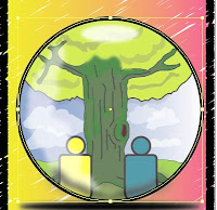
First, this is my roughly sketch for my poster:


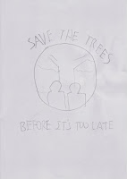
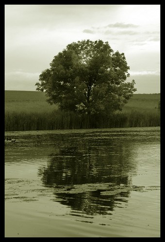
At the centre, I will make a big, shiny sphere. Inside of it, there is a big tree standing in the middle of the sphere. In front of the tree, I will draw two humans, but not in details. I want to draw them just like a 'symbol' looking beacuse I want the tree to be the main focus.


For the message, I will add the texts above and below of the sphere. The upper one will be 'Save the trees' while the below one will be 'Before It's Too Late'. About the background color, I will try to make a gradient color.


Now, the steps in the making of the poster:


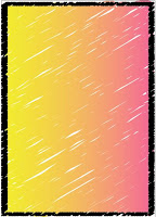
-First, I create one big rectangular until it fits to the border


-Then, I applied 'Scribble' effect to it and adjusted the color, variation, and width. The result is turned like this:


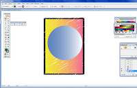
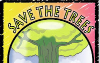
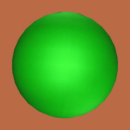
- Next, I used 'Eclipse tool' to create a big circle and applied the gradient color. This one, I want to make big and shiny sphere just like an earth).


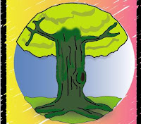
- Inside the sphere, I drew a big tree, just like in my previous work. It's a same technique by using 'Pen Tool' and 'Brush Tool' to draw a tree. For shadow effect on the tree, I created a random shape by using 'Brush Tool', make it black and adjusted its opacity to 50%. I also use 'Blur' effect on the tree to hide the tree trunk's excessive. For the ground, 'Rectangle Tool' is used and green color is applied. The excessive part of the ground has been adjusted with 'Warp Tool' to make it fit to the sphere.


- Then, I created a bunch of clouds by using 'Brush Tool', applied the white colour and make them 59% of it opacity. For the humans, I used 'Eclipse tool' to create two heads and 'Rounded Rectangle Tool' for the body. I've adjusted the body with 'Warp Tool' so the parts are not excessive out from the sphere.


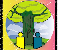
- To make the sphere look shiny, I created another circle and applied it with a white colour. I've adjusted its opacity to 39% so it looks transparent and then, placed it at the centre of the sphere.


- To add more shiny and reflective effect on the sphere, I created a circle, but make it look flat and not in a circle shape anymore. Apply with a white color, adjust its opacity to 81% and for this one, I used 'Gaussian Blur' to make it more realistic for the light reflection. After that, I placed it at the top of the sphere where the light source is came from. Also, at the side of the sphere, I created a random ,white in color shape with 'Brush Tool' and adjusted the opacity to 58% to create a low light reflection effect at the side.


- Now for the text, I started with 'Save the Trees' first and I want to put it at the top of the sphere. At first, I want to make it normal and flat, but I've decided to make it in curve around the sphere. In order to do this, I choose the sphere (the one with a gradient effect) as a path for the text to make it look curvy. The font for the text is 'Lithos Pro' and the font size is 90pt. Adjusting the text is quite tricky because the text did not look centered enough. It's also hard to adjust the angle around the sphere, so I just make it slowly. After I've satisfied with the text position, the text has been convert to normal out line by selecting 'Type>Create Outline". That means, I can freely adjust and resize my text. After that, the text is applied with gradient color and the size of the stroke is 5pt.
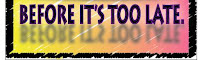


- Next text is 'Before It's Too Late' and I want to put it below of the sphere. The text font is still same, only the color is different and the font size is 85pt. Like the first one, after creating the text, I created the outline for it. and the text is just laying flat at the bottom. Now, for this one, I want to apply the reflection effect of the text, so it will look lovely for the poster. To do this, I'd duplicated the text into two. One is still remain in the position, while another one will be a 'reflection' for the text. To do this, I choose 'Transform' and rotate the text into 180 degrees. I put it below the orignal text and then, I choose 'Transform' again and reflect it vertically. After that, I applied 'Gaussian Blur' effect to it. Now the text has a nice, reflection effect.


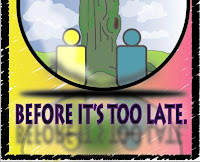
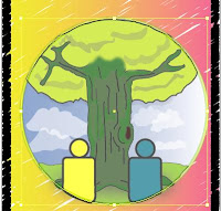
-Before I finished my work, I want to add more details on the poster. Since I've applied the reflection on the text below, I need to apply to the sphere and inside of the sphere too, so it will look more realistic. Like I did for the text, I used copy, reflect and rotate technique for the sphere. Since it's overfilled the border, I used 'Knife Tool' to cut out the sphere into a half and adjust it a little bit with 'Warp Tool'. All of it have been applied with 'Gaussian Blur' effect.


Now my poster has been finished!

3rd Assignment [Poster] - Research

Now it is my final assignment time. I need to do a poster based on the area of choices. I want to focus about 'deforestation' and in my poster, I need to show some messages too. Just like what I did on the previous work, I will make a tree as a main subject for my poster.

I've decided to draw an earth too, but since my lecturer said that drawing an earth is too common, so I need to find something that is similiar with earth. What I have inside my mind is just a sphere. Probably it is good if I create something that can reflect about the earth or should I say, something 'shiny'.

Here are some image references that I think will be helpful for my assignment:


Finally, I have decided on what to do for my poster. I need:
-To create a shiny, reflective sphere which is represented as earth
-To draw a tree inside the sphere
-To draw two humans in front of the tree, looking toward of it
-To decide what color that is suitable for my poster, so it will be more atrractive and good looking
I should do some sketch for my poster. Probably, I should go on simple, not so complicated on this one.

Tuesday, August 19, 2008

2nd Assignment [Illustration] - Finalization

Here is my final illustration:


TITLE: SAVE THE TREES

THE ILLUSTRATION REPRESENTS A TREE WITH TWO HUMANS. EVENTHOUGH THE TITLE SAYS: 'SAVE THE TREES' AND IN THE ILLUSTRATION ITSELF ONLY SHOWS ONE TREE, IT STILL REMINDS US THAT WE ARE NOT ONLY CARE FOR A SINGLE TREE, BUT ALL OF IT. A BOY AND A GIRL ARE SHOWING THEIR EXPRESSIONS TOWARD THE TREE BEHIND THEM, MEANS THAT THEY CARE AND WANT TO SAVE THE TRESS FROM BEING DESTROYED. THE BACKGROUND IS JUST A PLAIN, BLUE SKY WITH SOME FLUFFY CLOUDS. IT REPRESENTS THE GREAT, WARM FEELING, GIVING A GREAT DAY FOR ANY OUTDOOR ACTIVITIES.

Tuesday, August 12, 2008

2nd Assignment [Illustration] - The Steps

Here are the steps of my illustration:


-First, I drew a tree trunk with pen tool


-Coloring the tree with a green color and added some shader effect by creating any uneven objects, blacken it and make it 20-43% of it opacity.


-To create the tree's leaves, I used Pen Tool. Colored it and added some shader (just like the previous step).


- To make a ground, I used 'Rectangle Tool' to create a rectangle and colored it green. Using a 'Warp Tool', I've created the grassy looking ground by moving the points into some kind of bumpy line.


- For a cartoony boy, I used 'Pen Tool' and 'Brush Tool' to draw him. If I want to fix a wavy outline, I can use 'Warp Tool' or by moving a point so it will look smooth. For the girl, I completely copied the entity of the boy and pasted her beside of him. Then, I just draw the girl's hair, replaced it with boy's hair and fix the line so it will look like a girl. For the shadows, I used 'Eclipse Tool' to create two circles and compressed it until its look flat. The shadows have been placed on the ground where the humans are standing and the opacity has been changed to 40% with black in color.


-For the background, I have created a blue sky with some clouds. I used 'Pen Tool' to make the clouds, applied the white color and changed the opacity around 42 - 60% on each of the cloud. I created it in a different layer and changed it to a back layer. Now, the subjects will be in front of the background layer.


- Finally, before I finished my work, I need to arrange the layers, so they are in the correct position. Also, I need to check the line, color or anything that I feel inappropriate, so I won't do any mistake.

Monday, August 11, 2008

2nd Assignment [Illustration] - Sketch

Here is my early illustration sketch:


Actually, I want to make a boy and a girl are holding an earth with their hands with happy face at first. It shows that they are praising the earth and care about it. Since I have a better idea, I replace the old one with a new idea. My new idea is making a girl and a boy praising a tree behind them with a happy expression. I think that will be good for my illustration. So, that will be my final decision.

Sunday, August 10, 2008

2nd Assignment [Illustration] - Research

Second assignment is an illustration. I need to illustrate it in Adobe Illustrator. Before that, I need to know what kind of illustration and what is a good title for that.

Illustration also must based on the personal symbol that has created before. My own personal symbol is just a simple symbol. It has an earth, with a crown on the top of it and two smiley faces at the center of the earth.

In my research, I need to find a good example for my illustration (not copying it).
I try to find a good image of tree because a main subject for my illustration is tree. Here are some examples:


Also, in my previous symbol, there are two smiley faces. That will be presented as the humans, a boy and a girl. In my illustration, I will draw two human and behind them is a tree. It is kinda like a deforestation problem, so we must protect the trees. In my illustration later, I will draw one single tree only. Not to mention that the trees are so many and why I want to draw only one? That's because a single tree represents all of it. That's right, all of it.