Tuesday, August 19, 2008

2nd Assignment [Illustration] - Finalization

Here is my final illustration:


TITLE: SAVE THE TREES

THE ILLUSTRATION REPRESENTS A TREE WITH TWO HUMANS. EVENTHOUGH THE TITLE SAYS: 'SAVE THE TREES' AND IN THE ILLUSTRATION ITSELF ONLY SHOWS ONE TREE, IT STILL REMINDS US THAT WE ARE NOT ONLY CARE FOR A SINGLE TREE, BUT ALL OF IT. A BOY AND A GIRL ARE SHOWING THEIR EXPRESSIONS TOWARD THE TREE BEHIND THEM, MEANS THAT THEY CARE AND WANT TO SAVE THE TRESS FROM BEING DESTROYED. THE BACKGROUND IS JUST A PLAIN, BLUE SKY WITH SOME FLUFFY CLOUDS. IT REPRESENTS THE GREAT, WARM FEELING, GIVING A GREAT DAY FOR ANY OUTDOOR ACTIVITIES.

Tuesday, August 12, 2008

2nd Assignment [Illustration] - The Steps

Here are the steps of my illustration:


-First, I drew a tree trunk with pen tool


-Coloring the tree with a green color and added some shader effect by creating any uneven objects, blacken it and make it 20-43% of it opacity.


-To create the tree's leaves, I used Pen Tool. Colored it and added some shader (just like the previous step).


- To make a ground, I used 'Rectangle Tool' to create a rectangle and colored it green. Using a 'Warp Tool', I've created the grassy looking ground by moving the points into some kind of bumpy line.


- For a cartoony boy, I used 'Pen Tool' and 'Brush Tool' to draw him. If I want to fix a wavy outline, I can use 'Warp Tool' or by moving a point so it will look smooth. For the girl, I completely copied the entity of the boy and pasted her beside of him. Then, I just draw the girl's hair, replaced it with boy's hair and fix the line so it will look like a girl. For the shadows, I used 'Eclipse Tool' to create two circles and compressed it until its look flat. The shadows have been placed on the ground where the humans are standing and the opacity has been changed to 40% with black in color.


-For the background, I have created a blue sky with some clouds. I used 'Pen Tool' to make the clouds, applied the white color and changed the opacity around 42 - 60% on each of the cloud. I created it in a different layer and changed it to a back layer. Now, the subjects will be in front of the background layer.


- Finally, before I finished my work, I need to arrange the layers, so they are in the correct position. Also, I need to check the line, color or anything that I feel inappropriate, so I won't do any mistake.

Monday, August 11, 2008

2nd Assignment [Illustration] - Sketch

Here is my early illustration sketch:


Actually, I want to make a boy and a girl are holding an earth with their hands with happy face at first. It shows that they are praising the earth and care about it. Since I have a better idea, I replace the old one with a new idea. My new idea is making a girl and a boy praising a tree behind them with a happy expression. I think that will be good for my illustration. So, that will be my final decision.

Sunday, August 10, 2008

2nd Assignment [Illustration] - Research

Second assignment is an illustration. I need to illustrate it in Adobe Illustrator. Before that, I need to know what kind of illustration and what is a good title for that.

Illustration also must based on the personal symbol that has created before. My own personal symbol is just a simple symbol. It has an earth, with a crown on the top of it and two smiley faces at the center of the earth.

In my research, I need to find a good example for my illustration (not copying it).
I try to find a good image of tree because a main subject for my illustration is tree. Here are some examples:


Also, in my previous symbol, there are two smiley faces. That will be presented as the humans, a boy and a girl. In my illustration, I will draw two human and behind them is a tree. It is kinda like a deforestation problem, so we must protect the trees. In my illustration later, I will draw one single tree only. Not to mention that the trees are so many and why I want to draw only one? That's because a single tree represents all of it. That's right, all of it.

Monday, July 21, 2008

1st Assignment [Personal Symbol] - Finalization


This is my final symbol, after I've completed and confirmed it.

1st Assignment [Personal Symbol] - The Steps

Now, I've started my symbol in Adobe Illustrator. Here are the steps:


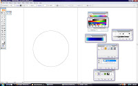
1) I started with a big, rounded shape by using 'Eclipse Tool'


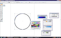
2) 'Stroke' thickness for the round shape was increased


3) The blue color is applied inside the round shape.


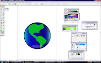
4) To make the earth's land, I used the eclipse tool to create two rounded shapes. Then, I used 'Warp Tool' to create some curvy line. Since the color of earth's land is green, so I filled it with green. After that, to make the earth look nicer, I applied the light reflection effect at the bottom of the earth. To make this effect, I created a round shape, applied the white color and make it 22% of it opacity.


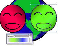
5) For the smiley faces part, again, I used 'Eclipse Tool' to create two faces. Also, I've applied the thickness of stroke on the outline of the faces. The gradient colors also have been applied for the two faces.

6) Then, I used 'Arc Tool' to create a happy-looking eyes for both faces. For the mouth part, rounded shape is needed. Then, I used 'Warp Tool' to create and move the points until the shape looks like a smiling.


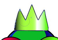
7) For the crown part, first, I created a square shape. Then, I used 'Warp Tool' to create a pointy surface at the top. Some of the points have been deleted with 'Delete Anchor Point Tool' to make the outline of the crown look smooth. To make the crown more shiny, I need to apply gradient color. It was easy to make the shiny effect since the gradient tool is easy to use.


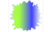
8) Finally, for a splash effect, again, I used 'Eclipse Tool' to create a rounded shape. ( I've used so many rounded shape for this symbol anyway). Then, by using 'Warp Tool', I just spread the points around until it looks like a splash. For the colors, gradient effect will make it look nice. The splash effect does not need a stroke I think or the front's symbol will not look visible.

Wednesday, July 9, 2008

1st Assignment [Personal Symbol] - Meaning of symbol

I've done a sketch for my symbol. Now, I need to plan for my symbol colour. Each of the shape of my symbol also represent the meaning.


Earth –
Our home or living place. We must care it for our next generation
Two smiley faces – Represent us. We should live on earth happily. Caring for earth will make us happy too.
Crown – Shows that the earth is like a ‘King’. In an ancient time, King must be respected by the citizens. Just like us, we must respect the earth for its nature and environment. The crown also represents the valuable of earth. The earth is just like a gold or valuable treasure that we should care of.
Splash effect – Show the true colour of earth. Green and purple are the suitable colours to show the earth’s existence.

*I don't have any reference to make this symbol since I'm only using my imagination to create it.